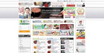
At first glance, Japan’s internet can feel like a time capsule. Websites are crowded with text, flashing banners, tiny buttons, and layouts that seem untouched since the early 2000s. For visitors and outsiders, it often feels confusing, outdated, and overwhelming. But for people living in Japan, it makes perfect sense.
So why does Japan’s internet look so “weird” to everyone else?


A Mobile-First Internet Before Smartphones
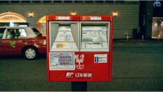
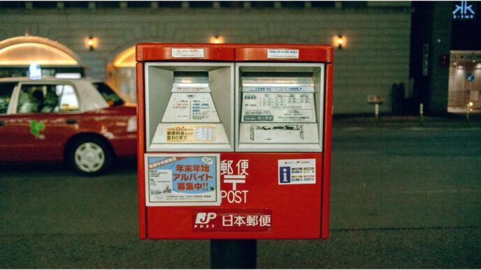
Japan went mobile earlier than most countries. In the late 1990s and early 2000s, millions of people accessed the internet through feature phones using services like i-mode. Websites were designed to deliver as much information as possible on small screens with limited scrolling. That legacy remains today, even on modern devices.
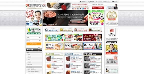
While Western web design favors white space, simplicity, and minimal text, Japanese users often prefer information density. A busy webpage signals credibility and thoroughness. Prices, options, disclaimers, and details are placed front and center so users don’t have to click multiple pages to find what they need.
In Japan, familiarity builds trust. Banks, government portals, railway sites, and major companies are cautious about redesigning their websites because sudden visual changes can confuse users. A layout that looks “old” to foreigners may feel reliable and easy to navigate for long-time users.
Unlike many countries where smartphones dominate everything, Japan still relies heavily on desktop computers for work, administration, and online services. Many official websites are optimized for desktop use, resulting in dense layouts that don’t always translate well to mobile screens.
Japanese communication values clarity, completeness, and caution. Websites reflect this by including extensive explanations, instructions, and warnings. While this can feel excessive to outsiders, it reduces misunderstandings and user errors especially for important services like healthcare, finance, and transportation.
Advertising and Ranking Culture
Japanese websites often prioritize visibility. Multiple banners, promotions, and ranking badges (“No.1 in Japan!”) are common because they reassure users and highlight popularity. What may look cluttered to some is actually a form of social proof.
Japan’s internet isn’t broken or behind; it’s shaped by different user expectations and historical choices. Newer apps and startups in Japan do follow modern global design trends, but many established platforms stick to what works for their audience.
In the end, Japan’s internet only looks strange if you judge it by foreign standards. Once you live in Japan or spend enough time using its services the logic becomes clear. It’s not designed to impress. It’s designed to inform, reassure, and function.
Originally written by- BY THU-HUONG HA
STAFF WRITER
Link to the article –https://www.japantimes.co.jp/life/2025/12/15/style-design/japan-internet-web-design/